Showing posts with label Nicole Evangelou. Show all posts
Showing posts with label Nicole Evangelou. Show all posts
Monday, 13 January 2014


Thursday, 9 January 2014
PRODUCTION - Target audience feedback
I thought it would be a good idea to get some audience feedback on my ancillary products. I will make improvements following this feedback is there is any constructive criticism


Monday, 6 January 2014
EVALUATION PLANNING - Q3+4
How did you use media technologies in the construction and research, planning and evaluation stages?
- State of the art video cameras - used to film all of our footage and memory cards used as storage for our filming. Learnt how to alter settings for better filming quality e.g: AF/MF, zoom, light/dark toggle etc.
- Still cameras - used to capture images during filming etc
- Blogger - used to record process of research, planning, production, evaluation. New blog - post - update and so on - adding labels, adding pictures/videos/html's
- Apps & websites used in conjunction - powerpoint presentation, prezi, slideshare, gif creator - used to create slideshows/presentations/moving images. Prezi very helpful for creating pitch. Slideshows useful when displaying images from filming etc.
- Social networking - Twitter/instagram used to keep teachers updated on filming progress
- Internet - Youtube in particular used a lot during research period
- Photoshop - used for production of ancillary products - digipak and magazine advert. Used to put together products from scratch, became familiar with how to insert images, text and edit these components to create structure
- Final cut pro - used for editing of footage and creation of music video - special effects such as slow and fast motion, colour altering, cutting and shortening of clips, reversing footage
- Created an animatic using Photoshop
What have you learned from your audience feedback?
- Overall reaction to video in cinema was positive - not much excitement until the end due to slow pace
- Learnt that editing and performance have the most impact on audience opinion
Thursday, 19 December 2013
PRODUCTION - Production of magazine advertisement

This shows how I began to create and develop my magazine advert. I used Photoshop to open up a blank a5 sized landscape page and immediately coloured it Black to match the Digipak. I then added the CD cover using the rule of thirds. Next I added text followed by some company logos. I took another look at what I had done and decided it needed some more detail so I put on 5 stars and wrote a review line from a music company. I made sure I stuck to the Black and White colour scheme.

PRODUCTION - Production of digipak inside

This is a screenshot of me putting together the inside of my digipak using Photoshop. I used the paint bucket to make the background colour black then placed the image I edited in it's position. I then cut the cityscape image to shape to fit in the cd compartment.
PRODUCTION - Production of digipak inside - image

Following a slight change of plan for the inside of my digipak, I decided to digitally manipulate one of the other photographs I took as I believe it will link the front and inside together more. On Photoshop, I changed the hue/saturation and colouring to make it match the image on the front.
PRODUCTION - Production of digipak front and back

This screenshot was captured in the making of the front and back of the digipak. I used Photoshop to placee together different components which make up a digipak. My first step was changing the colour to black followed by adding the edited image to the front. I then added the text for the artist name, album name, copyright information and track listing. Lastly I put the finishing touches such as the barcode, record label ident etc. I had to ensure the layers were placed correctly so nothing was hidden underneath something else.
PRODUCTION - Production of digipak front & back - image
Before designing the digipak itself, I had to choose which image to use and digitally manipulate it to get it to black and white and in a suitable contrast/hue


Monday, 16 December 2013


Thursday, 12 December 2013

Monday, 9 December 2013


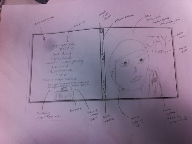

PLANNING - Previous student work
In class we looked at some previous student examples and this is one that I particularly liked. I really love the way the landscape image covers both the front and back cover. The placement of the artists face and writing across the digipak make it look really realistic. The font is not simple but is still easy to read and it matches the image and hue/saturation. The student included all the relevant information and placed it in places that make sense. As we used a lot of city footage in our video, I am considering replicating this students image idea

Subscribe to:
Posts (Atom)