Showing posts with label James Muir. Show all posts
Showing posts with label James Muir. Show all posts
Thursday, 16 January 2014

Evaluation - Question 2
How effective is the combination of your main product (video) and ancillary texts (digipak and advertisement)?
I think I have linked my music video to my ancillary work extremely well. I incorporated synergy whenever I could. Before creating our music video as a group we decided what synergy we're going to incorporate into our video which included:


 The clip above is part of my music video and shows how the setting is dark and white and black effects are in use which links the video to my ancillary work as it is a black and white theme (above)
THE CLOTHING - HOW I HAVE LINKED MY MAIN PRODUCT TO MY ANCILLARY TEXTS

The clip above is part of my music video and shows how the artist is wearing casual clothes throughout the music video, which links it to my ancillary work as the artist is wearing casual clothes(above)
THE ARTIST - HOW I HAVE LINKED MY MAIN PRODUCT TO MY ANCILLARY TEXTS
The clip above is part of my music video and shows how the artist is shown throughout the video and the use of close ups, this was done to promote the artist and as you can see on my ancillary texts(above), the large Image I have used to help promote the artist looks exactly like the last bit on the clip.
THE IMAGES - HOW I HAVE LINKED MY MAIN PRODUCT TO MY ANCILLARY TEXTS


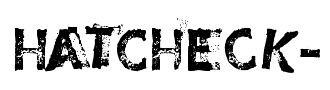
 I have decided to keep all text the same for my digipak and magazine advert because I feel it could be a link of synergy. The font i used was "Hatcheck" which is quite unique therefore I believe people would be able to remember it and be interested in it. The main reason I chose this text was because it's like rundown/broken and stands out and as this song is quite emotional I thought it would suit it. I have challenged the convention as I decided to stay consistent with my text even though the conventions say you should use a different text.
THE LYRICS - HOW I HAVE LINKED MY MAIN PRODUCT TO MY ANCILLARY TEXTS
 I have decided to include lyrics on my digipak so that it is linked with my main product. I have used most of the song including the chorus so when people see the lyrics on the digipak it will give them a visual image of the music video. By doing this I have created a link between the music video and my ancillary texts.
I think I have linked my music video to my ancillary work extremely well. I incorporated synergy whenever I could. Before creating our music video as a group we decided what synergy we're going to incorporate into our video which included:
- Shots of scenery in London, we will be using establishing shots in our music video and we will also be using pictures we have taken of scenery in London on our digipaks.
- Black and white theme, in the music video some parts will be black and white and we will be using a black and white theme for our digipaks.
- Costume and props, The artist will be wearing casual clothes and also a watch which will be shown on all platforms of production
THE COLOUR SCHEME - HOW I HAVE LINKED MY MAIN PRODUCT TO MY ANCILLARY TEXTS
THE CLOTHING - HOW I HAVE LINKED MY MAIN PRODUCT TO MY ANCILLARY TEXTS
THE ARTIST - HOW I HAVE LINKED MY MAIN PRODUCT TO MY ANCILLARY TEXTS


The clip above is part of my music video and shows how the artist is shown throughout the video and the use of close ups, this was done to promote the artist and as you can see on my ancillary texts(above), the large Image I have used to help promote the artist looks exactly like the last bit on the clip.
THE IMAGES - HOW I HAVE LINKED MY MAIN PRODUCT TO MY ANCILLARY TEXTS
The clip above is part of my music video and shows how the setting is dark and white and black effects are in use which links the video to my ancillary work(above)
THE FONT - HOW I HAVE LINKED MY MAIN PRODUCT TO MY ANCILLARY TEXTS
THE FONT - HOW I HAVE LINKED MY MAIN PRODUCT TO MY ANCILLARY TEXTS
 I have decided to keep all text the same for my digipak and magazine advert because I feel it could be a link of synergy. The font i used was "Hatcheck" which is quite unique therefore I believe people would be able to remember it and be interested in it. The main reason I chose this text was because it's like rundown/broken and stands out and as this song is quite emotional I thought it would suit it. I have challenged the convention as I decided to stay consistent with my text even though the conventions say you should use a different text.
THE LYRICS - HOW I HAVE LINKED MY MAIN PRODUCT TO MY ANCILLARY TEXTS
I have decided to include lyrics on my digipak so that it is linked with my main product. I have used most of the song including the chorus so when people see the lyrics on the digipak it will give them a visual image of the music video. By doing this I have created a link between the music video and my ancillary texts.
Monday, 13 January 2014
My use of Photoshop throughout the project
When we first got introduced to the ancillary production part of the project we had to have a practice go in creating the cover of a digipak using a random image. I am not that much of a fan of Photoshop as i rarely use it however i knew that we needed to use it to produce are digipak therefore i got straight to work on my practice digipak. I didn't really know what tools to use and how to use certain tools so i just kept trying them all out and seeing what there use is. The list below is what skills i have learnt during my use of Photoshop:
- Enlarging images without stretching them after importing them, you do this by holding "Alt"
- How to arrange layers and change different layers positions
- How to add effects such as black and white
- How to get rid of red eye
- How to add colours and change what colour is primary and secondary
Below is the progress I have made from my initial practice digipak cover to my final digipak cover. I feel as if I progressed hugely as I learnt how to use all the tools and when to use them.


Thursday, 9 January 2014
making progress on the magazine ad

I quickly discovered what image i wanted to use on my magazine ad and that is the same image i used on the front cover of my digipak. I decided to use it again because it's a clear image of the artist so helps promote the artist and also it will help people realise the music video if they see the same image on the magazine as well as the front cover of the digipak. I then chose what i wanted too say therefore i inserted the text onto the magazine ad and the size i wanted the text to be. The whole idea of the digipak is to promote the artist therefore the artist's name is the largest followed by the album now.
Mock up of inside cover
Instead of designing my mock up initially on paper and printing an image out which i did on the front cover i decided to go straight into photoshop to create the mock up of my inside because i believe its much more simplistic than the cover of the digipak. Also it gave me the chance to develop on it rather than starting again. I couldn't think of what images to use therefore i decided just to add the same one. I think i am going to keep this image on one of them however not both. Also by creating this mock up it required me with the skill to use the ellipse marquee tool which i needed. I am not quite sure what to add now as i don't want to overdo it but i will definitely be adding something as it is far too plain at the moment.
Monday, 16 December 2013
Working on the inside - how i created the CD
Working on the inside - how i created the CD
I am using Adobe Photoshop to create my digipak. I started off by using the shape tool in which i created a circle and then another circle within that circle to make it look like a disc. I made sure the disc took up the whole page. This is illustrated in the image below.

Secondly, i picked the image i wanted to use to put on my CD. The group and I purposely went out and took pictures within our local area to use for our digipak's. This is one of the images i decided to take. I decided to take this image because i felt it suits our music video and is appropriate as there is sunshine and the artist is looking right up to it. This is a sign of synergy because sunshine is used throughout our music video so when you see this CD you should relate it to the music video. After selecting my image I opened it up in Photoshop and selected the "Eclipse tool". The eclipse tool gave me the ability to cut a circle out of the image as you can see in the image below the white dotted circle line is when i had the eclipse tool in use.

Finally, after cutting out a circle of my image i allocated it where i had the initial disc template which i created earlier. As i had the template i didn't have any problem with size and where it should be. To make it easier i just put the circular image over the blank CD shape. I did this by putting the circular images layer over the CD shapes layer, however i then didn't have the small white circle in the middle but soon realized i had to put the small circles layer over the images layer. In the end the first layer was the small circle followed by the image and then finally the big circle. The finished CD is shown below on the right hand side.

My Mock Up front cover
I had a problem with the printer and pictures came out too large therefore the mock up is not 100% accurate. As the pictures are too large i couldn't fit the album and artist name in the size i wanted to therefore had to make them smaller.


Thursday, 12 December 2013
My progress on the front cover

I have added both the images i am going to use as well as the track list, bar code, production label, album name and artist name. I have just made the font red at the moment however i may keep it red if not i will change it to white. Also the font i have at the moment isn't that clear to read therefore i will be changing it. My next step is to add the copyright information in then change the positions of the bar code and production label. In then will look into different fonts and what colour suits these fonts and after that i should be more or less finished.
Progress on front cover of my digipak

Just a quick blog to show how i am getting on creating the front cover of my digipak. I went to the studio room and took quite a few pictures of our artist and have made my decision to use the one i have which is on the right hand side. I have decided to use this picture as my front cover because the idea is to promote the artist and therefore i have took a close up, looking straight at the camera. I have also gone for the black and white theme because of our genre of music i don't think it should be very colourful and as the songs are quite depressing. There is still a lot to be done such as the font style and layout of the track list and also the positioning and style of the artists name and album name.
Monday, 9 December 2013
Images I'm planning to use in my digipak
Below are the Images i am planning to use in my digipak.
Below is the picture i am going to use on the front cover with the artist name and album name. I have decided to use this picture because it's a close up of the artist and i believe by just having him on the front cover it's the best way to promote him as he stands out and you can easily see the face of the artist. For example if there was too much going on and an image of the artist not facing the camera properly or a long shot this wouldn't help promote the artist.

Below is the picture i am going to use on the back cover with the track list, barcode, record label and copyright information. I didn't need to use an image of the artist on the back cover however i believe it doesn't do any harm and the more you promote the artist the better.

Below is the picture I am planning to use on the inside of my digipak. Infact im planning to use this image on the actual CD itself. I will be using the eclipse tool on photoshop to turn it into a circular image in which i can then make it into the CD. I have decided to do this because i feel without it, the CD would seem a bit dull and boring. I am using this image below because there is use of synergy as he is looking at the sunshine and in our music video the chorus contains a line "I need sunshine" and also there are parts of sunshine in our video.

The font i am planning to use
Below is the font i have planned to use throughout my digipak. I have decided to use this font because I believe it makes the digipak more eye catching and it suits the genre of our album as it's not plain and boring it's like it's damaged/run down and this possibly shows the emotion in the song. I also don't think anyone will have trouble reading it.

Sunday, 8 December 2013
Digipak Do's and Don'ts
DO'S:
- Use a clear font
- Make sure every part of digipak is equally good (inside and outside)
- Make the artist the most important thing
- Use clear pictures
- Make sure you use synergy which helps create a brand for artist
- On the back cover make sure you have the tracklist, record label and barcode
- Have artist name bigger than album name
- Stretch images to make them fit
- Have artist name smaller than album name
- Use loads of colours, more than 3
- Cover the artists face with text or another image
- Use an image that has nothing to do with the music video
- Use a messy font which is hard to see
- Focus just on front cover of digipak and not inside
Friday, 6 December 2013
Digipak Influences - previous students
I had to take pictures of previous students work. I did this by using a still camera. i the uploaded them onto desktop to use in the powerpoint.
Subscribe to:
Posts (Atom)